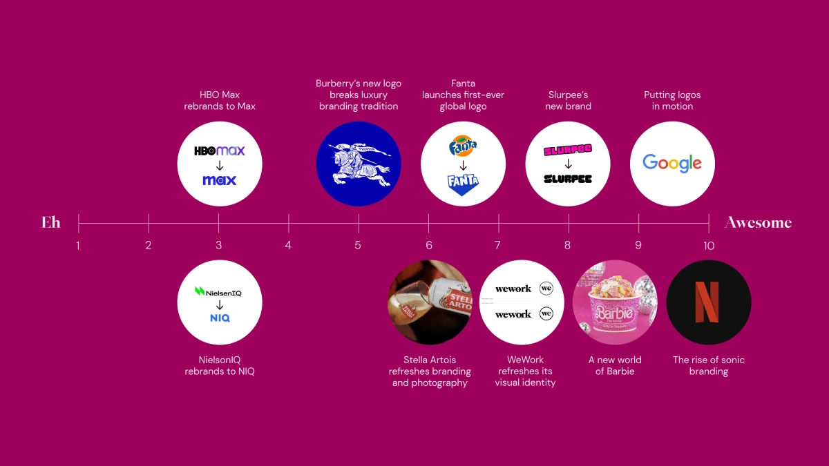
At Agenda, we’re here to help our clients find their awesome and make it obvious. And seeing other brands out in the world gets our wheels spinning. Introducing the Agenda Awesome Scale, where we look at news in the branding world through our own filter, ranking rebrands and trends on a scale of eh to awesome.
NielsenIQ and GfK rebrand to NIQ:
After a recent merger, consumer intelligence and market research companies NielsenIQ and GfK are now officially NIQ with a new logo, color palette, brand purpose and brand promise. While this was definitely the right time for a rebrand, their new logo blends in with all the other blue and white tech logos. Think Gartner, Amplitude, Infosys, etc. And how do you pronounce the name? Nik? Nee-que? N.I.Q.? Feels like there was space to differentiate and they played it safe. 3.
HBO Max rebrands to Max:
If you're a subscriber you know HBO Max has rebranded to just “Max” and changed out its purple identity for blue. The new name is meant to convey a broader scope of offerings and convince viewers it has more than just HBO content. But does this name really work? Sure, dropping HBO minimizes confusion for subscribers but personally, we always used to say “it’s on HBO” not “HBO Max.” Not to mention “Max” was originally a convention to convey that HBO had more to offer. It's like if Disney+ just became +...kind of weird. 3.
Burberry's new logo breaks from luxury branding tradition:
If you follow branding trends in the luxury space, you've seen the trend of luxury brands with simple, clean, black and white logos in a sans serif font. Well, Burberry finally broke this trend with their new logo. The update uses a serif font and adds a dose of nostalgia branding by bringing back their classic equestrian in royal blue (finally some color in a luxury logo!), that leans on their British heritage. It feels like a refreshing break from a sea of logo sameness. And bonus points for being the first to break it. 4.
Fanta launches first-ever global brand identity:
For the first time since the brand was founded in 1940, Fanta is launching a global brand identity. The new logo maintains an energetic and playful feeling, while ditching the orange fruit from the current logo so as to not confuse consumers about their various flavors. From a consumer perspective, a consistent, global brand identity makes a lot of sense. And with parent company Coca-Cola launching a global identity for Sprite last year, it seems like the right time for Fanta. 6.
Stella Artois refreshes branding and photography:
This March, Stella Artois announced a new brand and photography style that skews towards a younger audience, no doubt to stay relevant in today’s market. The announcement included a horizontal logo, custom typeface and new color palette. But most notably, the updated photography style revolves around the ‘modern table,’ a concept that shows how dining has become less formal and is simply wherever people gather together, whether that be a bench, a sofa or a stoop. Pretty interesting concept and they definitely have a strong point of view on their target audience—we just hope its the right one. 6.
WeWork refreshes its visual identity:
Earlier this year, WeWork announced a new brand identity with a new logo, color palette, typeface and illustrations. A move to modernize the brand while keeping its current personality, the company’s new logo is similar to the original. However, the new color palette with blue, yellow, orange and purple, as well as the hand-drawn illustration style, makes the brand more vibrant and human. Pretty cool, we'd give it a 7. But we'll add a point if environmental branding is a part of this rebrand!
Slurpee's new brand:
7-Eleven recently gave its iconic drink a new logo and colors. The new logo, with capitalized letters and a bolder, wavier font, paired with the new, neon color palette, better capture the energy and vibrancy of the drink. There has been some controversy on the tail of the ‘S’ in the logo, but personally we think it's a cute nod to the shape of the drink. Plus, this rebrand also included a new cup design. We're already on our way to 7-Eleven to see it for ourselves. 8.
Logos in motion:
A logo is often the first visual customers get of a brand. So it makes sense that brands are getting creative with what they do with their logo. Animated logos quickly tell a story and show a glimpse of a brand's personality. Whether it's a simple animation or a short video, logos in motion are a great way to grab audiences’ attention. This trend is quickly becoming popular. In fact, we've done a few ourselves. 9.
A new world of Barbie:
By now you must’ve heard about, if not seen, the new Barbie movie. Well, so have all your favorite brands. Many brands across industries are taking advantage of this highly anticipated movie, jumping at the chance for a collab. From fashion companies like Crocs, Forever 21 and Fossil, to restaurants like Burger King and Coldstone, as well as home goods like Ruggable, Joybird and Homesick Candles, the list goes on and on...and on. While we have doubts about the individual collabs (do we reeeally want Barbie cosmetics from NYX ?), we haven't seen a trend that influenced such a wide range of industries in a while. It really was the summer of Barbie. 9.
The rise of sonic branding:
Audio advertising, or as we call it, sonic branding, is the next big thing. From simple sounds like Netflix’s “ta-dum” to podcast intros or even full blown songs, audio is an awesome way to create personal connection with your audience and can lead to higher recall, so its a no brainer that a lot of brands are getting behind this. Just think of McDonald’s “Ba da ba ba bah, I’m lovin’ it”—bet you sang it in your head when you read it. 10/10!


