The safest way to break the rules
When it comes to branding a law firm, the playbook seems to dictate playing it safe. It’s a field where taking risks isn’t rewarded and following the pack can feel like the best course of action. But a rigorous, structured approach can actually pave the path to a bold, unexpected brand.
A sea of status quo
There’s a tendency towards certain language in law—a little bit lofty, a little bit vague. Messages that sound inspiring but ultimately don’t say much about the type of firm you are and what sets you apart. Often, firms lean on their years of experience or recent accomplishments, but that puts a lot of work on the audience to figure out what it all means and why they should choose you. On the one hand, this type of messaging is inclusive. Broad statements like “positive change” and “future focus” aren’t likely to exclude people or foreclose any business opportunities. But when you speak to everyone, you don’t connect with anyone.
Building a case for your brand
Strong brands start with a clear strategy. That’s always true but it’s especially important when you’re looking to break away from the pack in a field that values sameness. You need a core insight that’s both unexpected and undeniably true. That insight should inform the way you look, feel, talk and behave, creating a through-line that makes every aspect of your brand purposeful. An ownable core insight also gives you space to push the creative execution of your brand, activating your strategy in a bold way. Even if it raises eyebrows, it ladders up to something everyone can agree on. Think of it as building the case for your brand. Next, you need to get buy-in. Identify stakeholders from across the firm, incorporating a range of perspectives. And don’t forget to think beyond lawyers—you’re building a brand the whole firm should see themselves in, from staff to partners.
Breaking the mold with Schulte

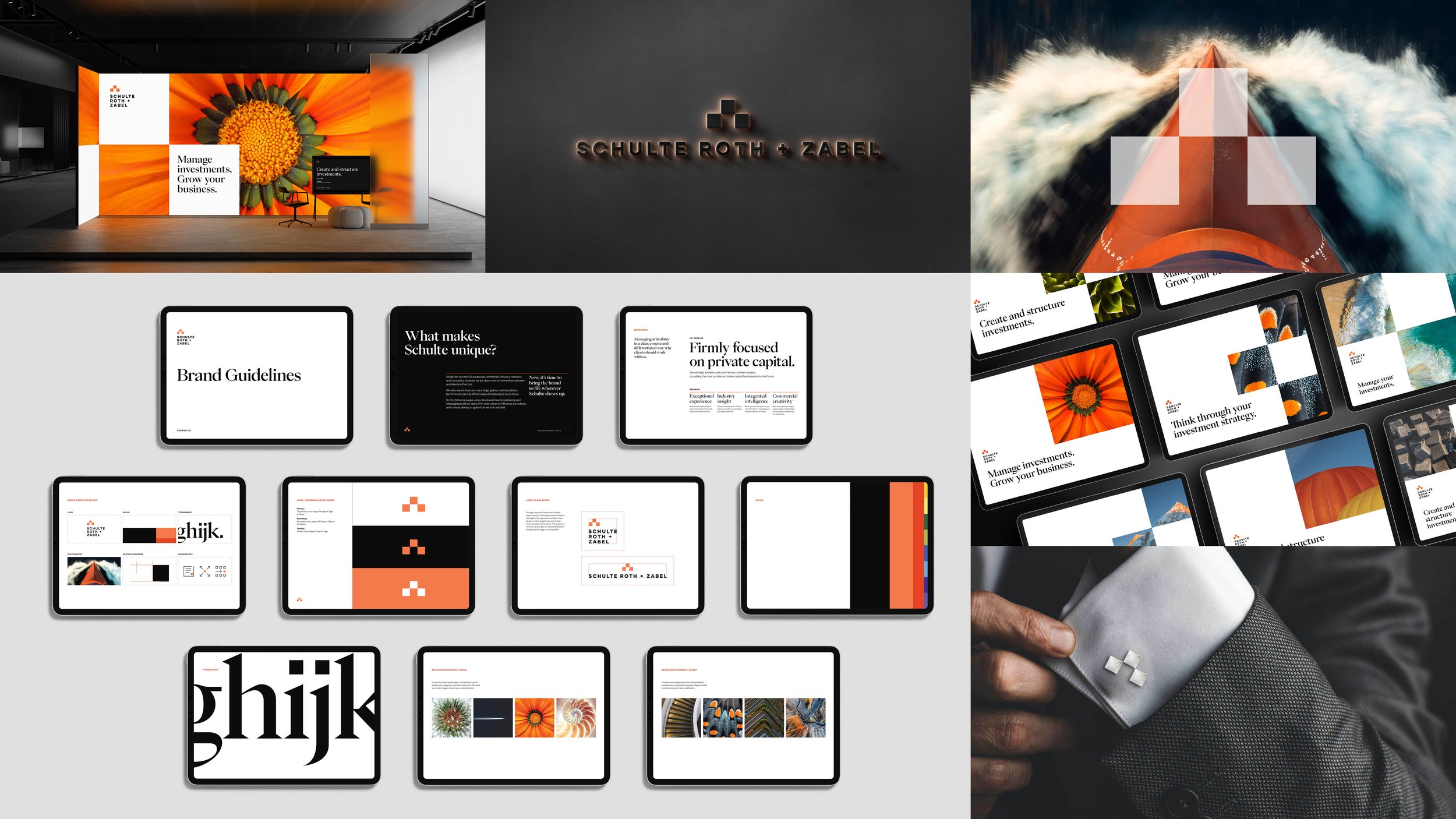
Schulte Roth & Zabel is a law firm with deep specialization in financial services. They’re a leader in the space but weren’t conveying their unique value proposition. Early on, we realized that their firmwide focus on private capital sets them apart. Their new brand owns this firm focus, with messaging and a visual identity that tell the story of their specialized expertise. A mark with three squares puts them on a pedestal as pioneers that will push the industry forward. The use of orange conveys their creativity and passion, with a color infrequently used in the space. A governance team of partners across the firm were instrumental in selling the work. And workshops with staff helped everyone understand how to live the brand, making them ambassadors who showcase what it means to be Schulte. See the brand.
Insights from Claudia Mark, Head of Creative


