Challenge
Milliman is a global leader in actuarial consulting—a network of the top minds in the industry tackling the toughest challenges in risk, finance and healthcare. But the decentralized nature of their organization and way of working had become reflected in their brand. Instead of telling one cohesive, powerful story—they were telling many.
Insight
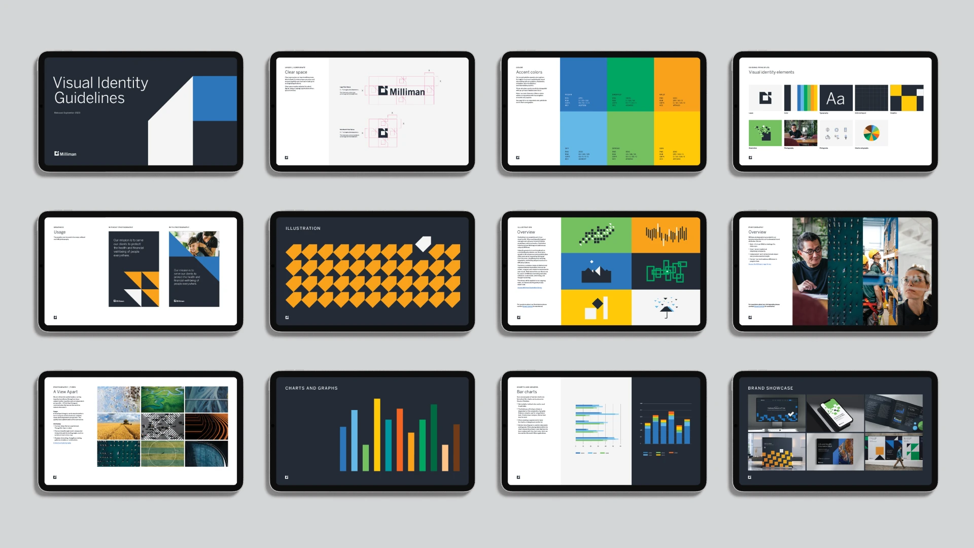
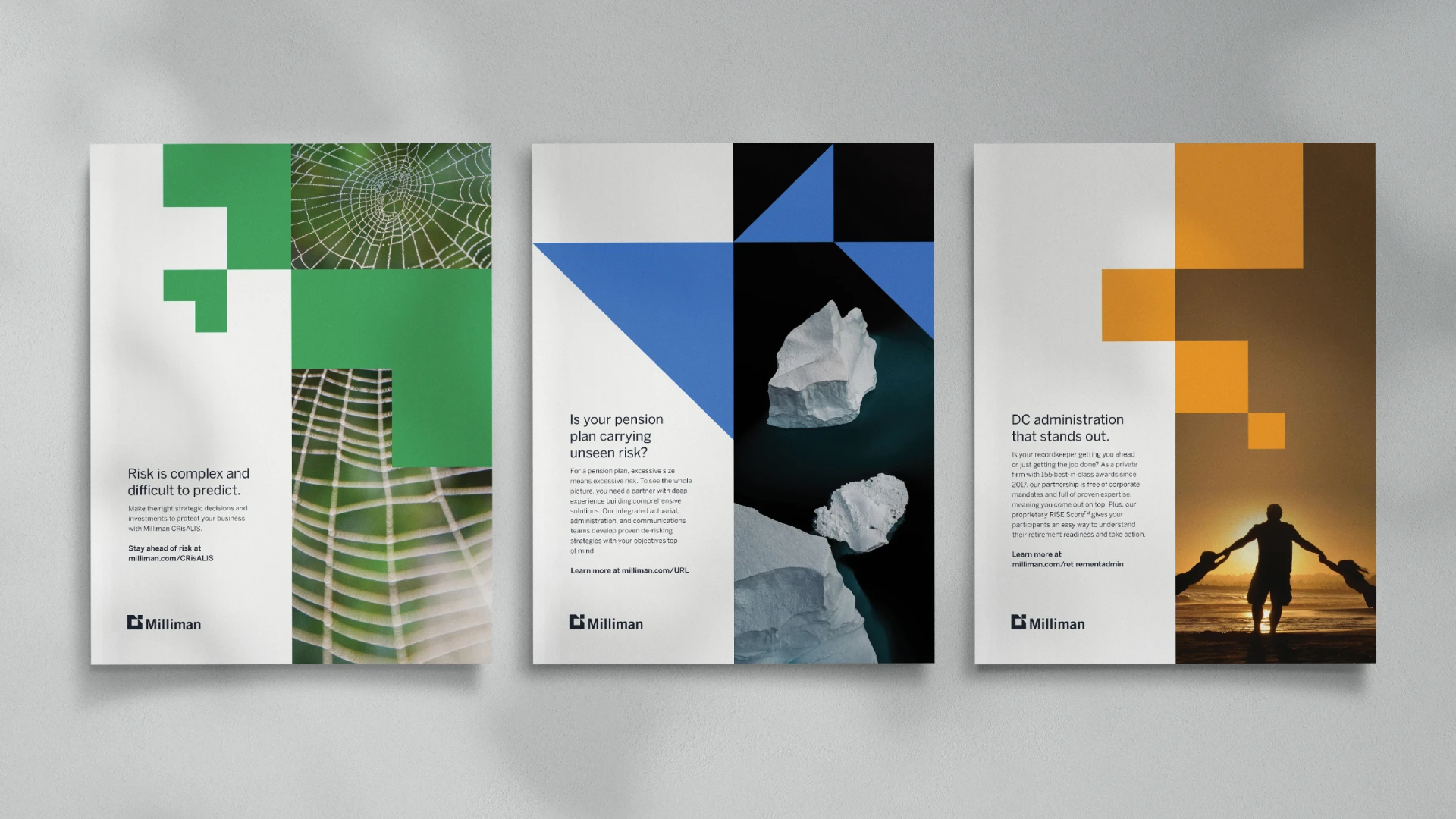
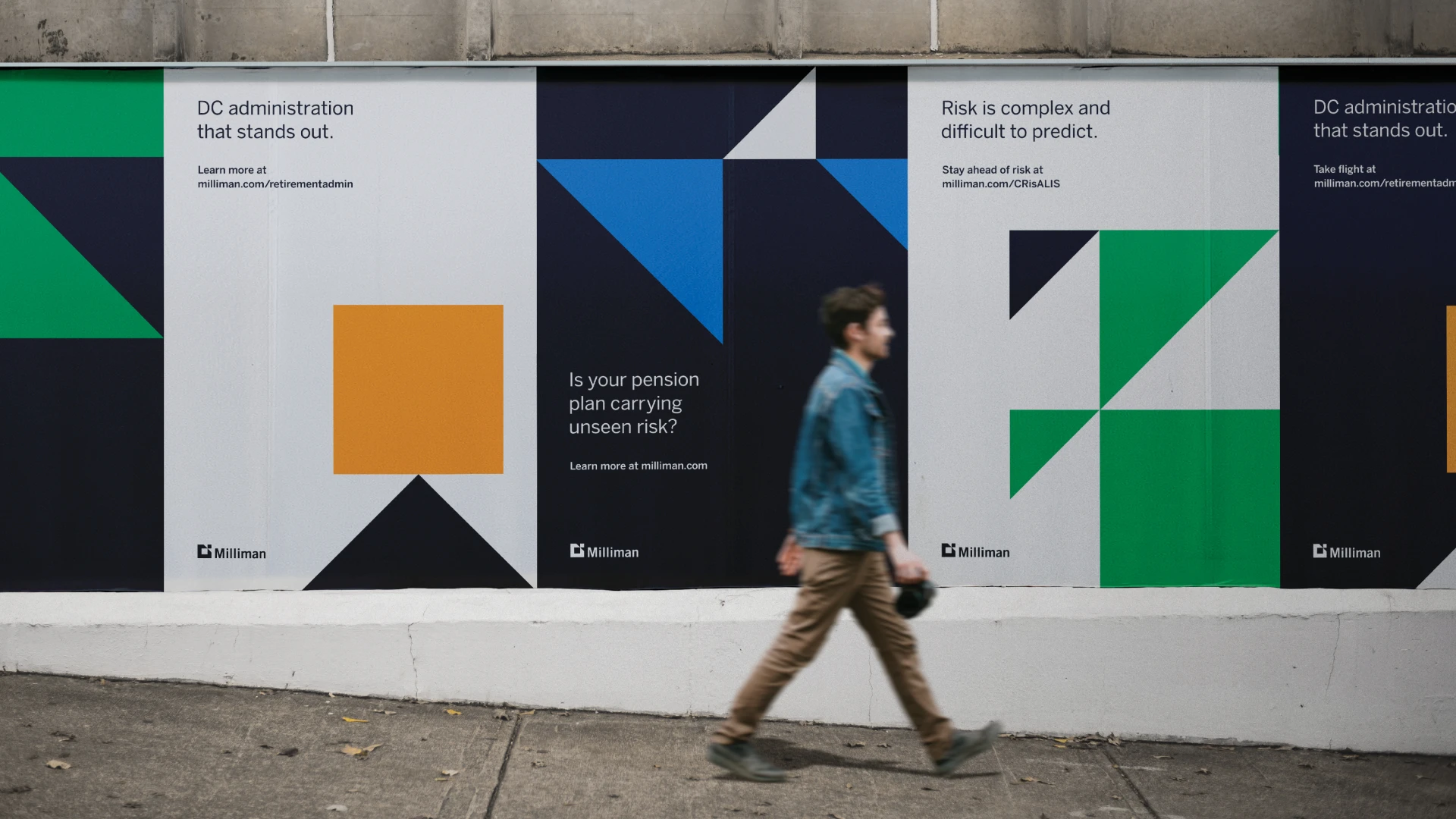
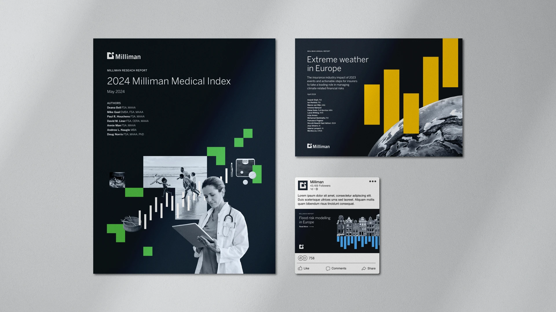
To combat this challenge, we set out to create a consistent and fresh visual identity that highlights the core of who Milliman is and what they stand for, elevating their leadership in the industry. Together, we found our inspiration and the root of the new brand in their brand mark. Their logo showcased their ability to take an independent perspective and to have “a view apart.”
Solution
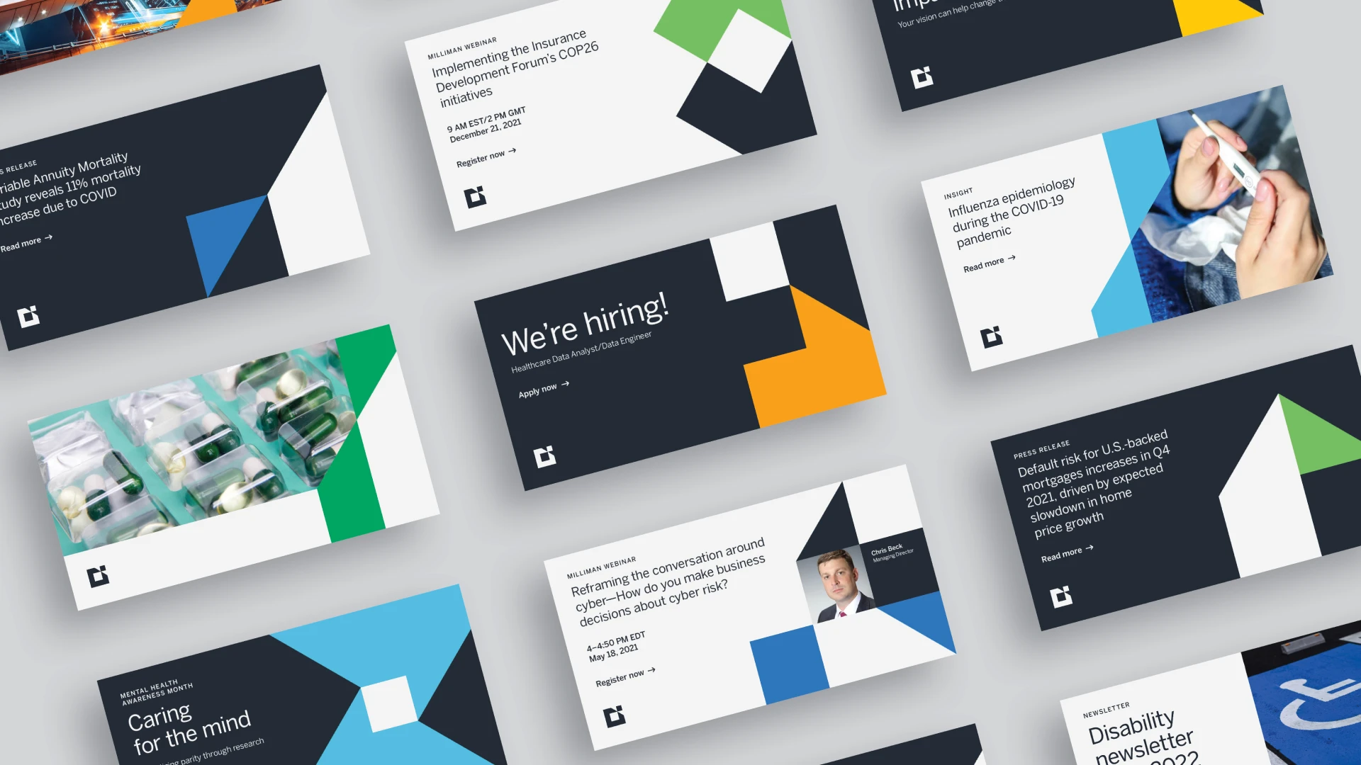
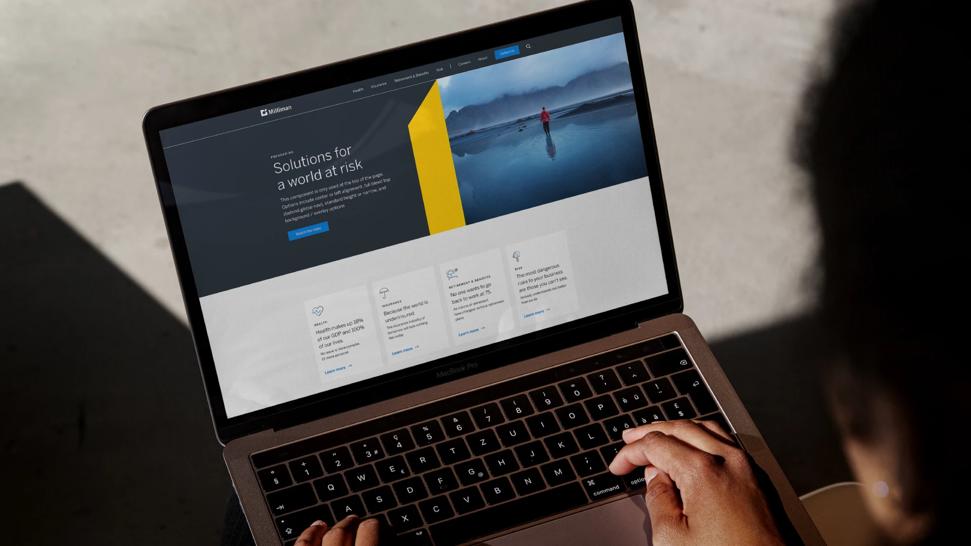
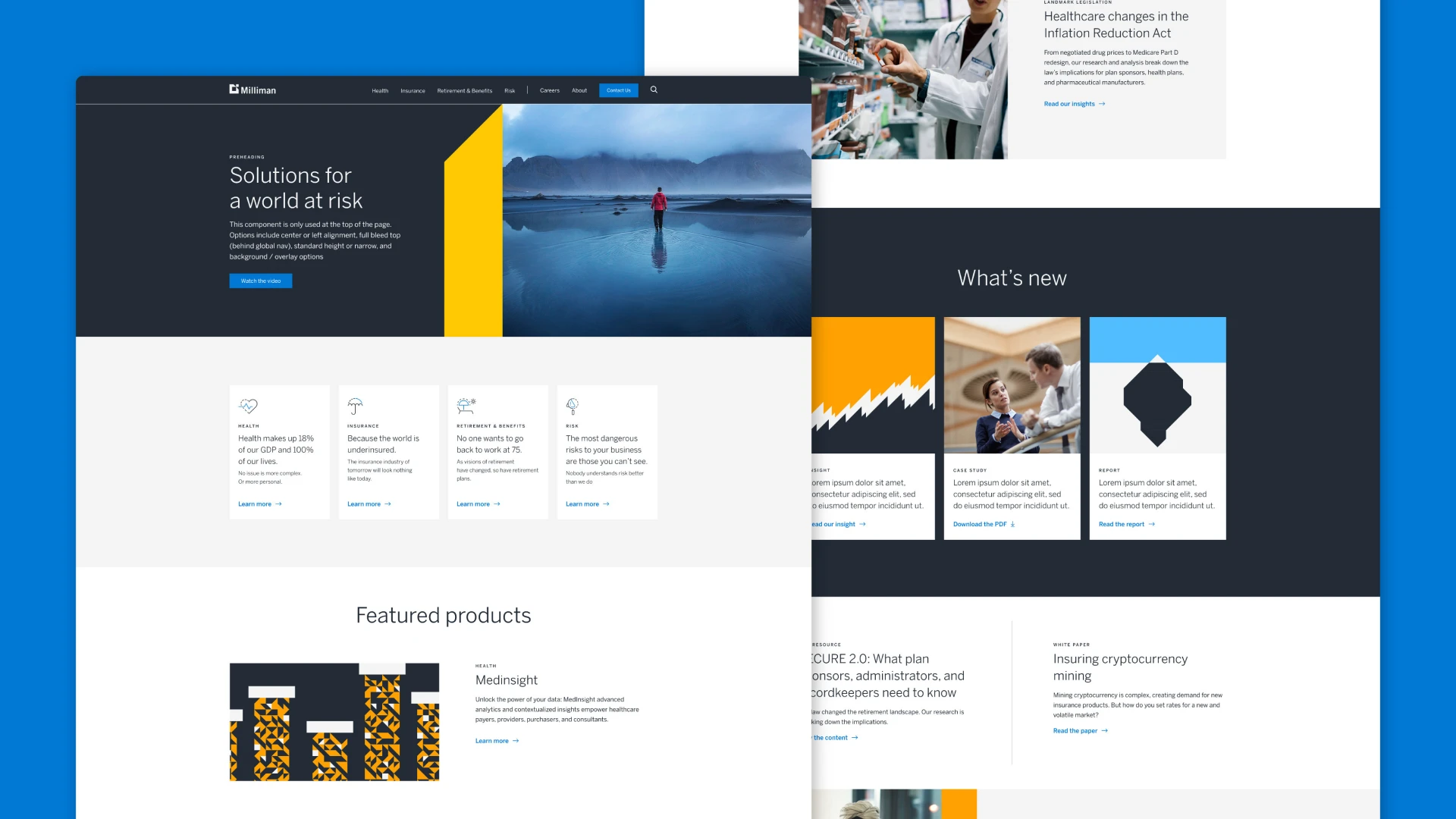
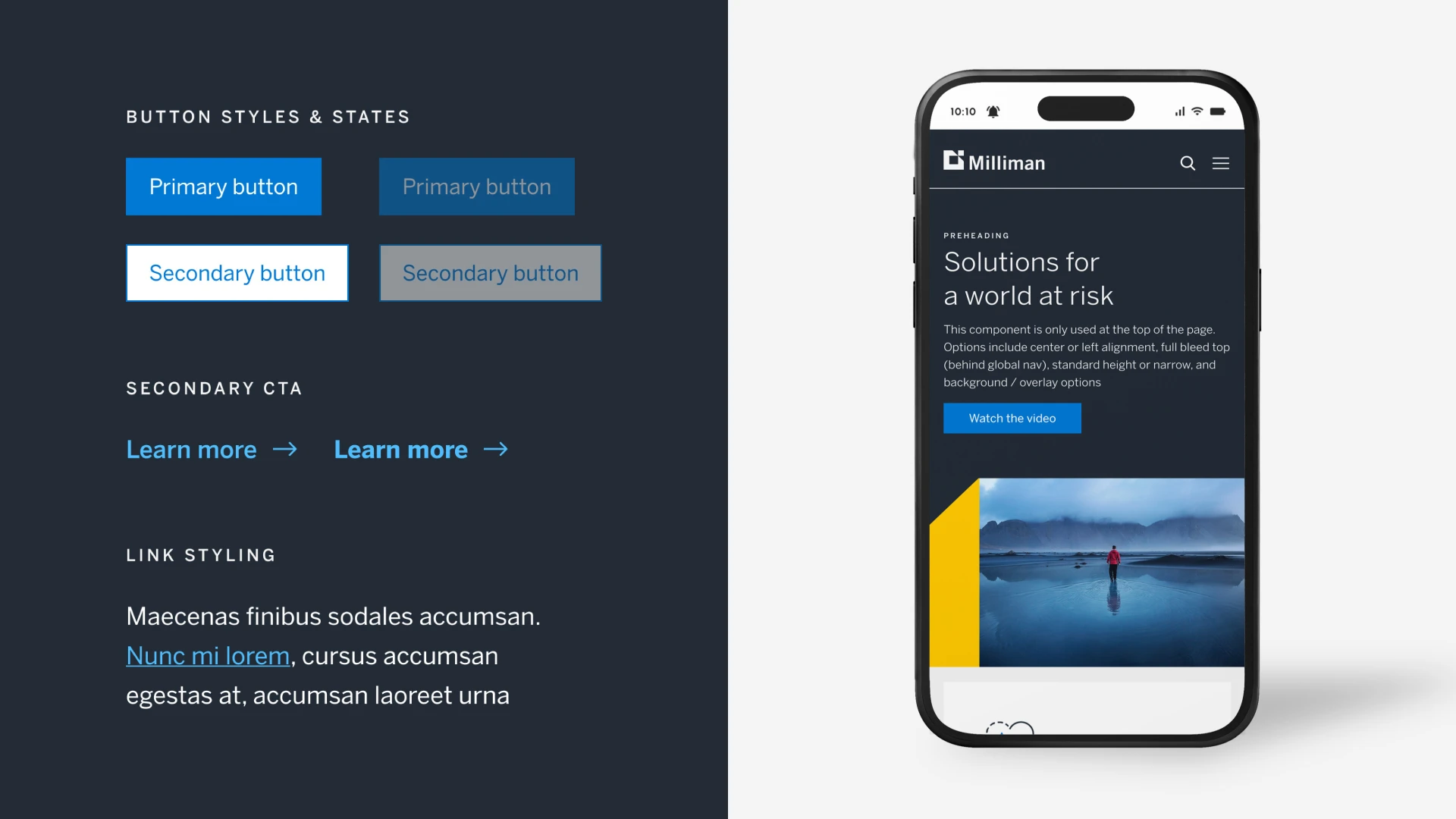
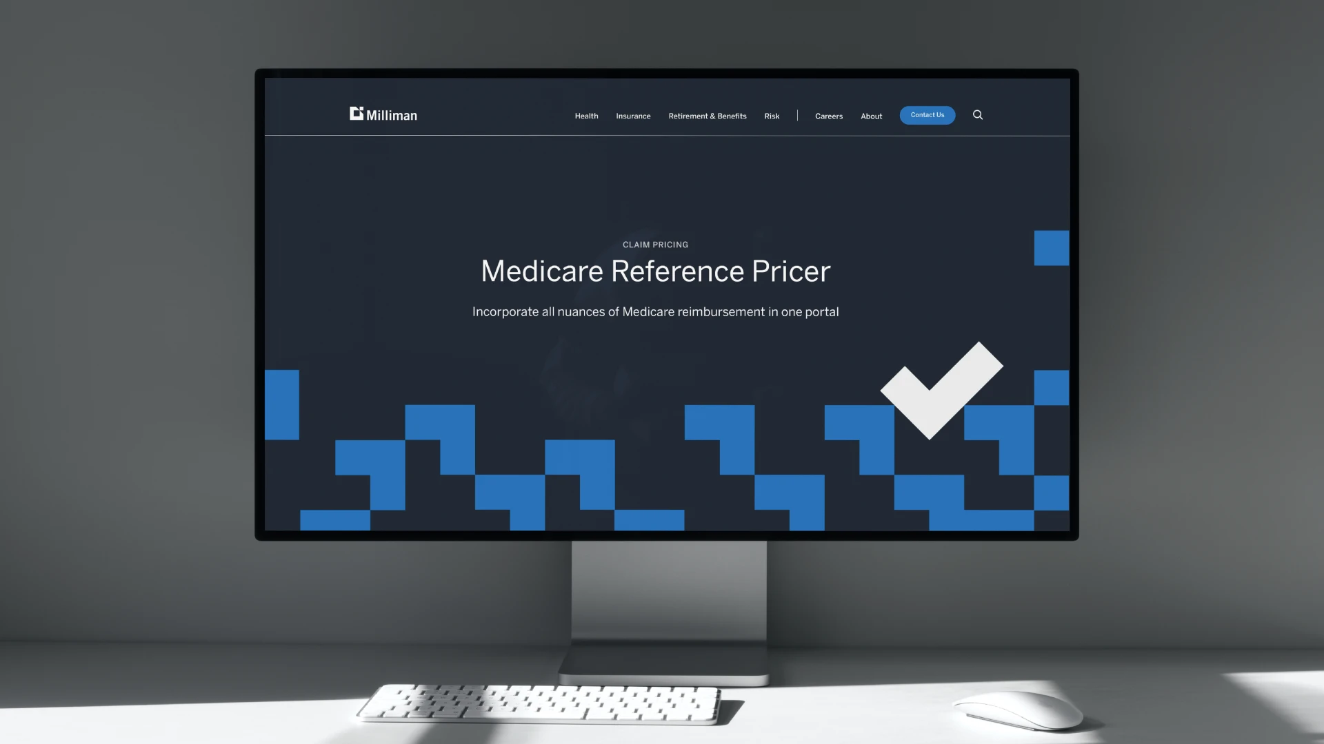
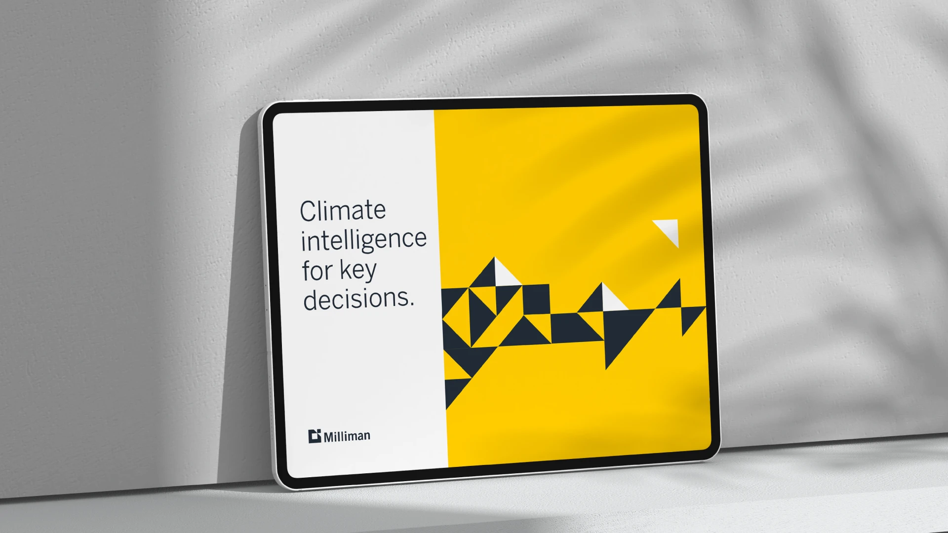
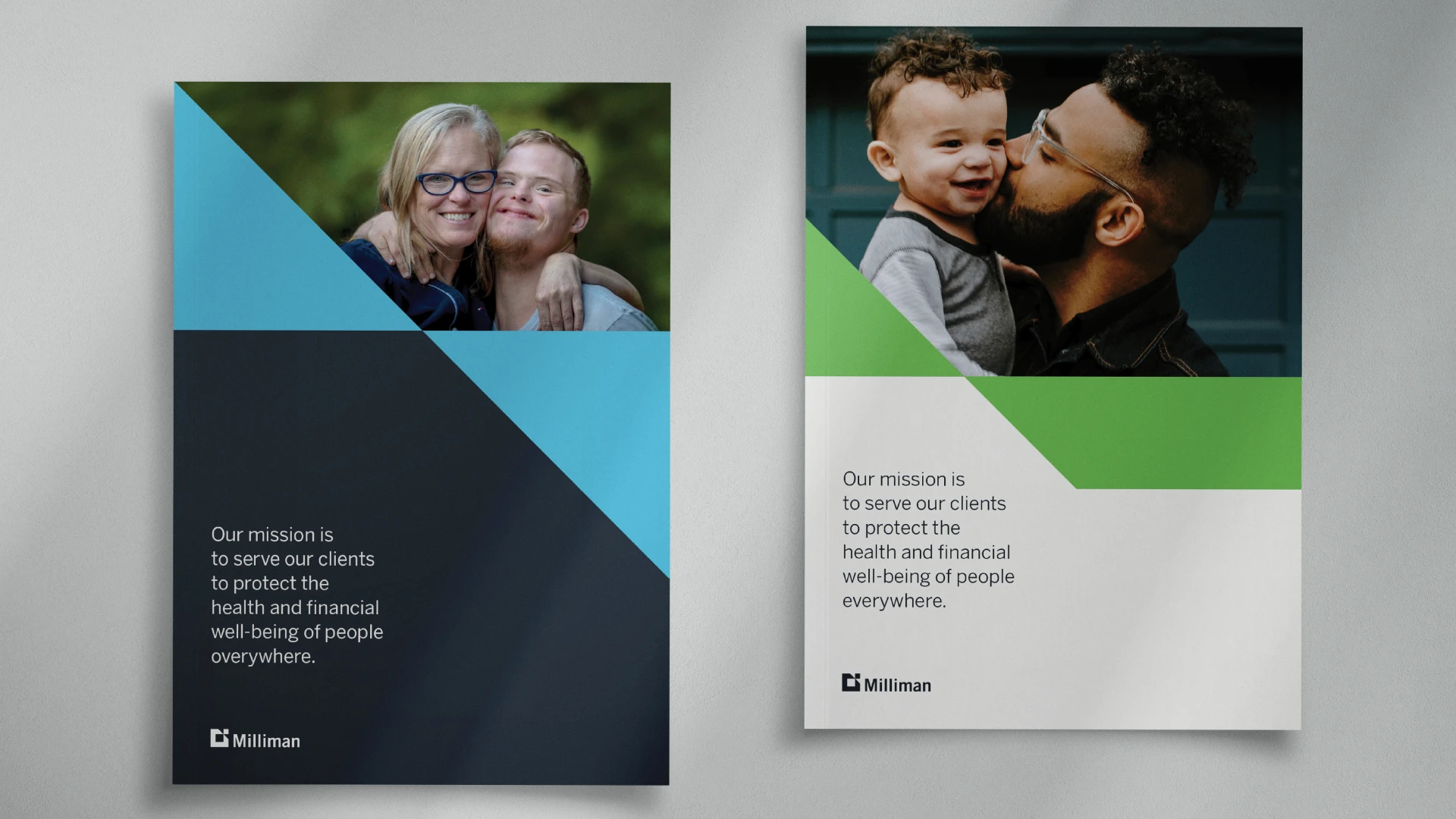
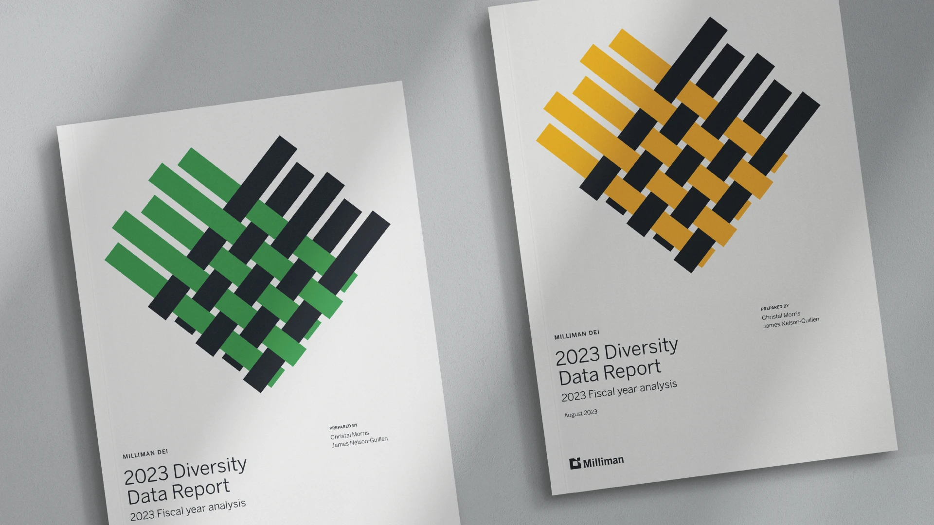
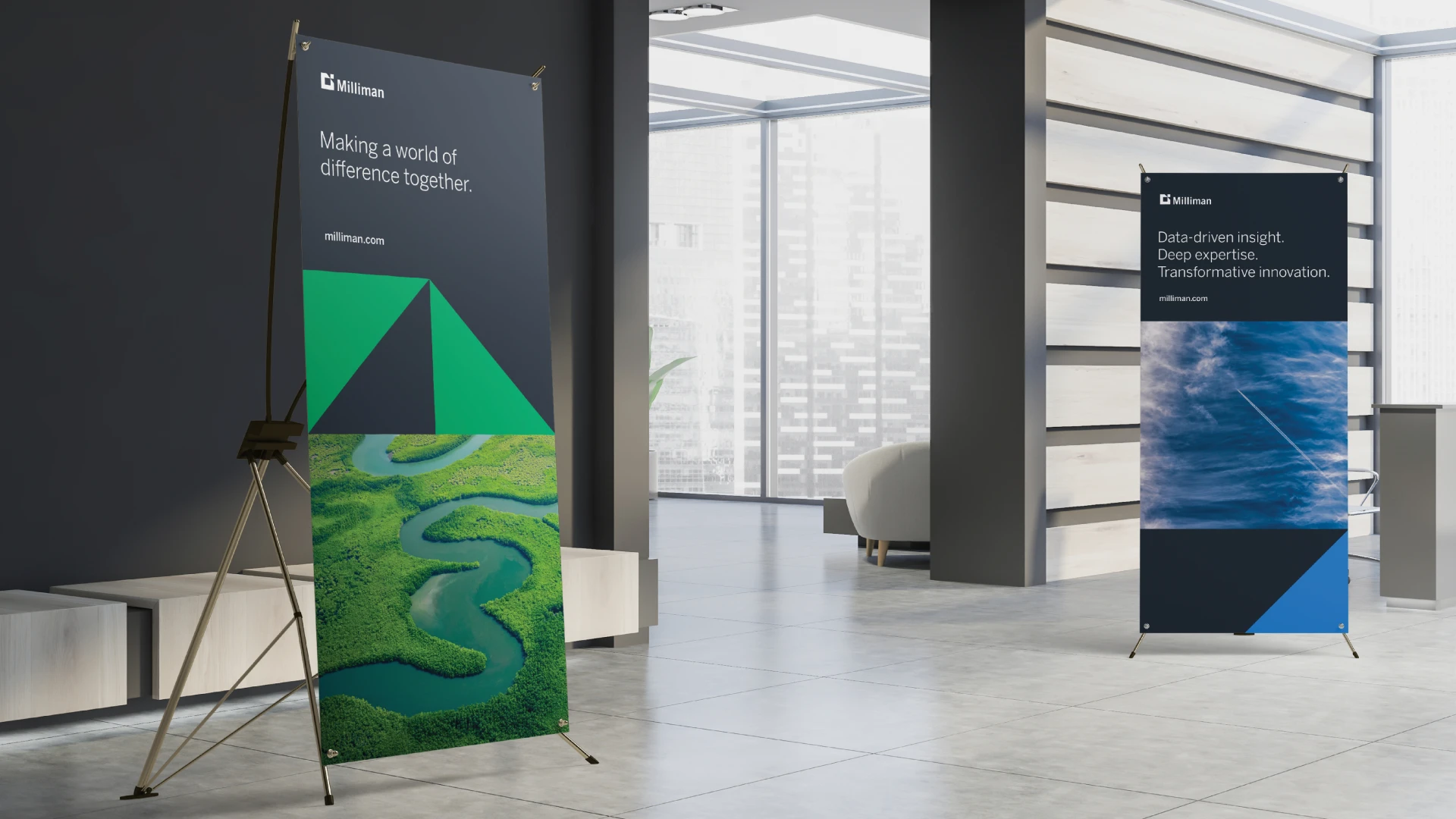
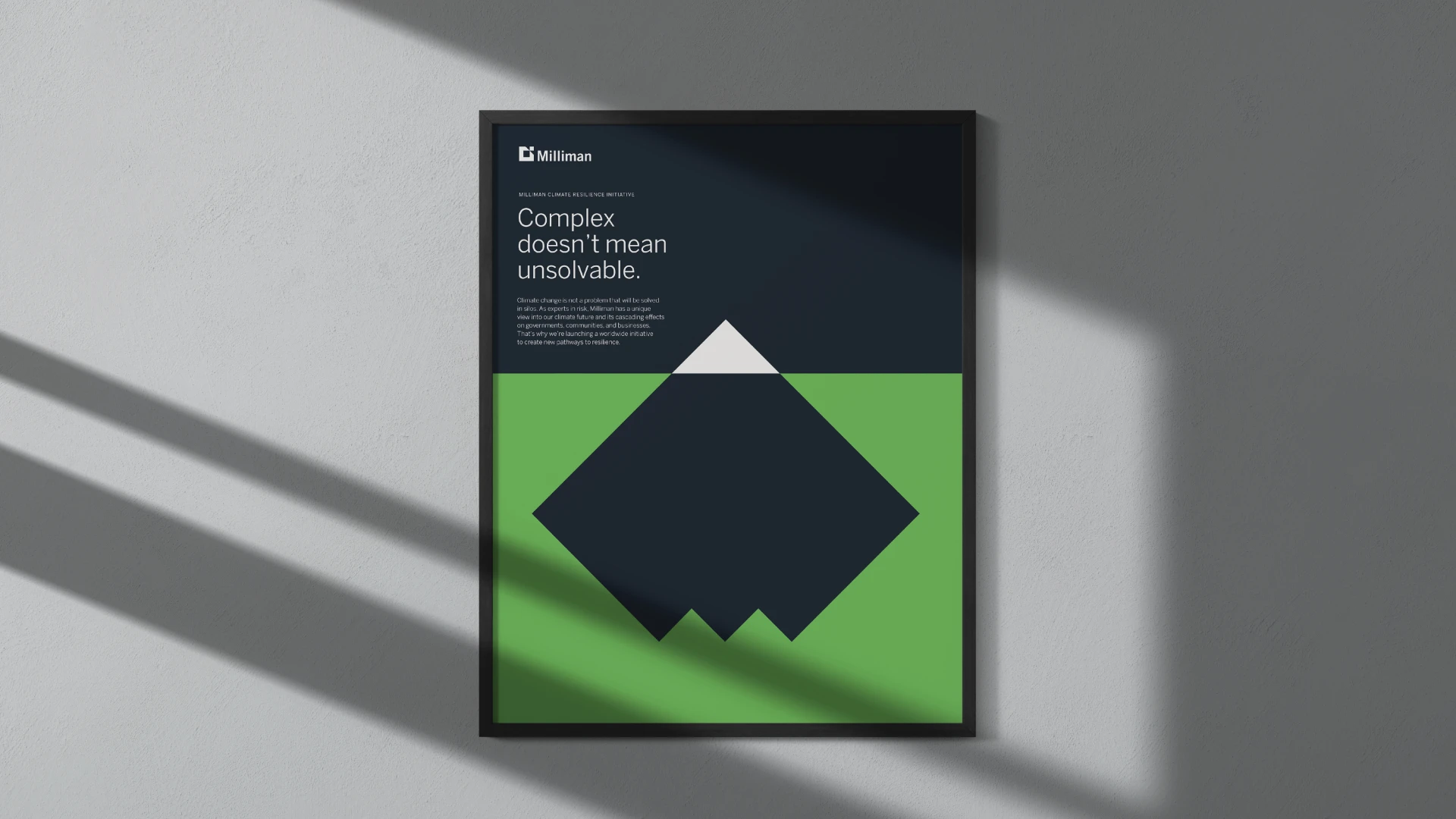
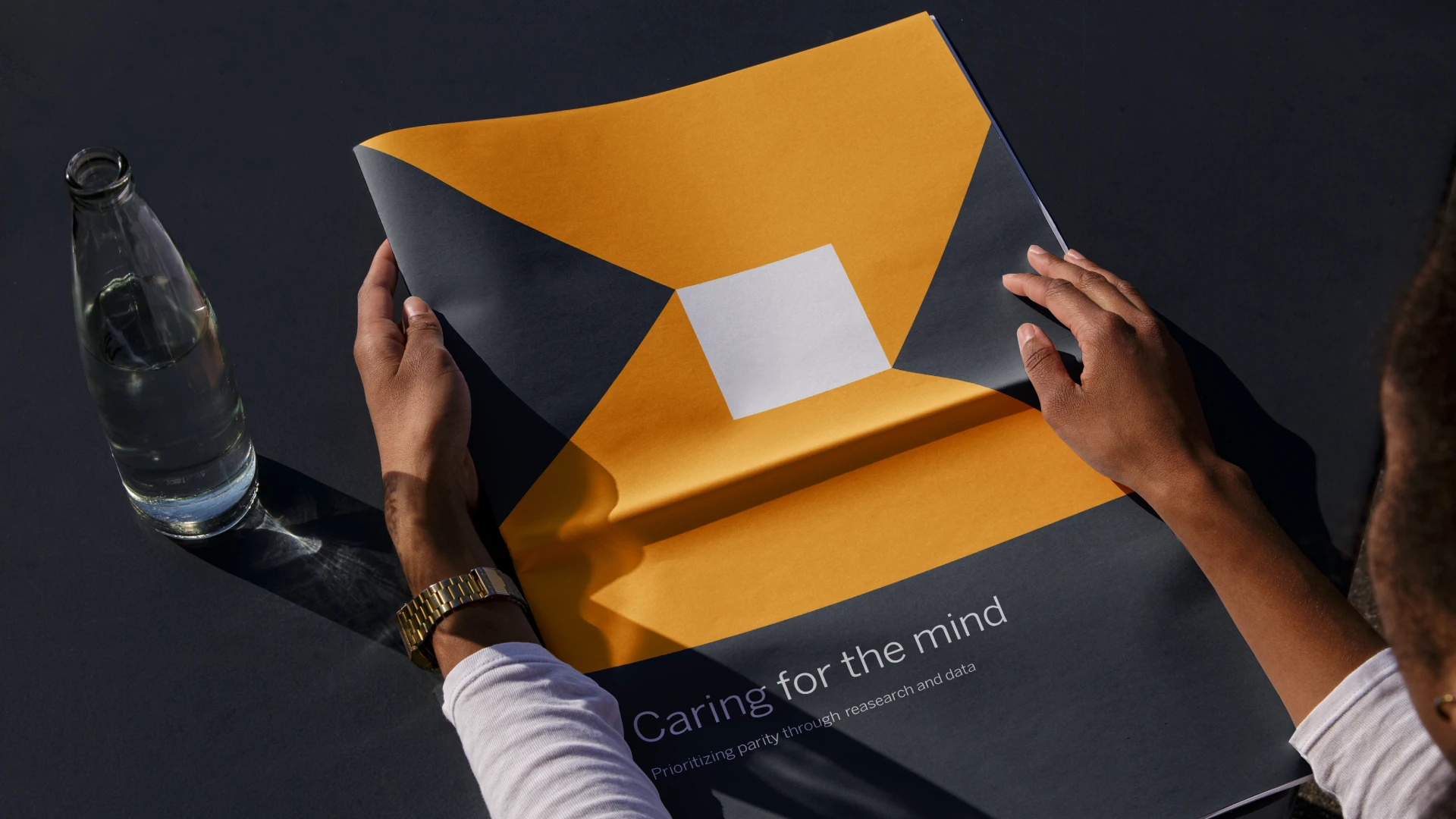
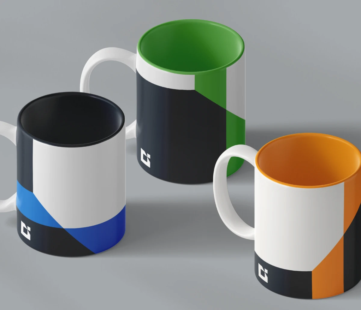
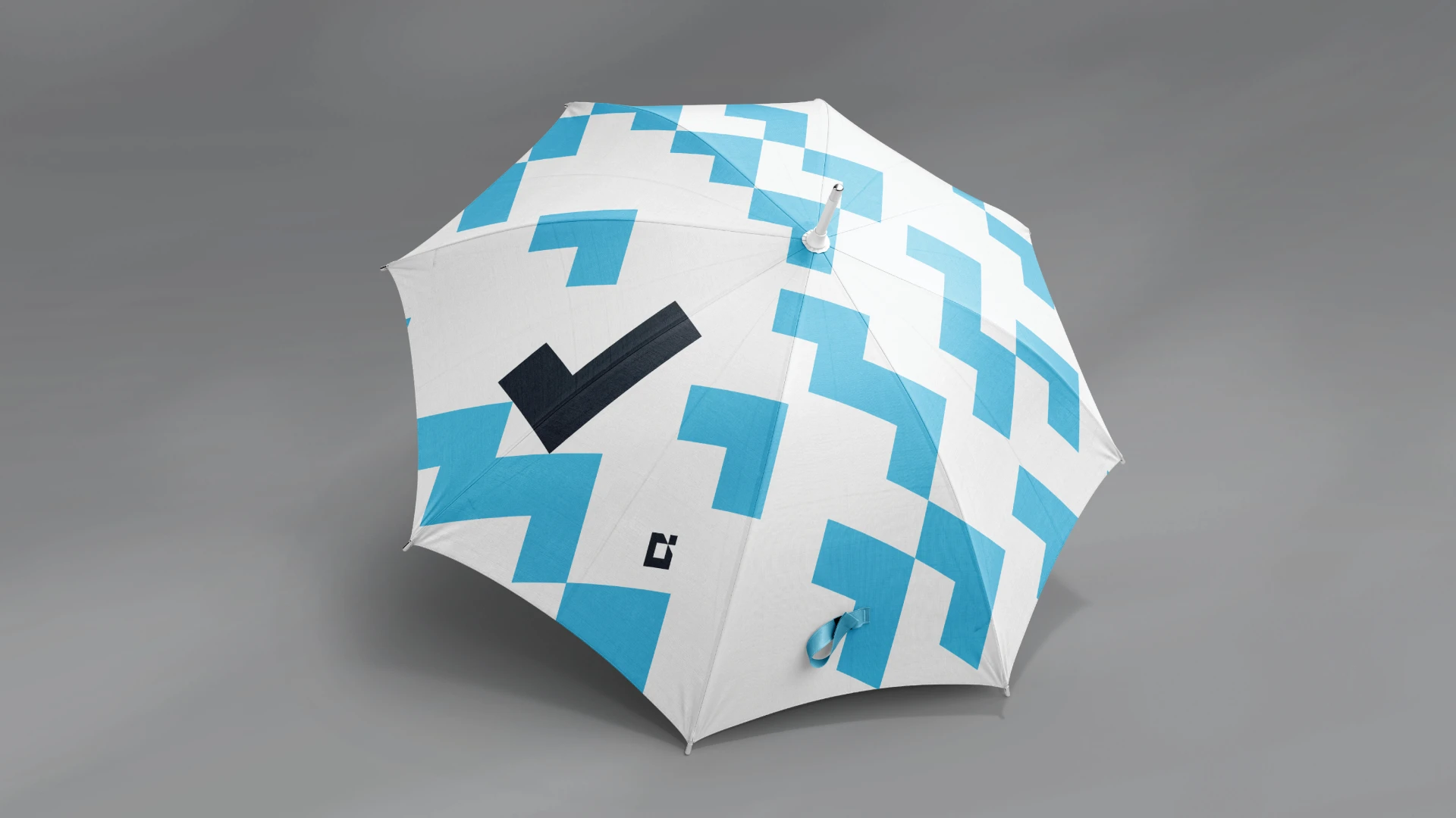
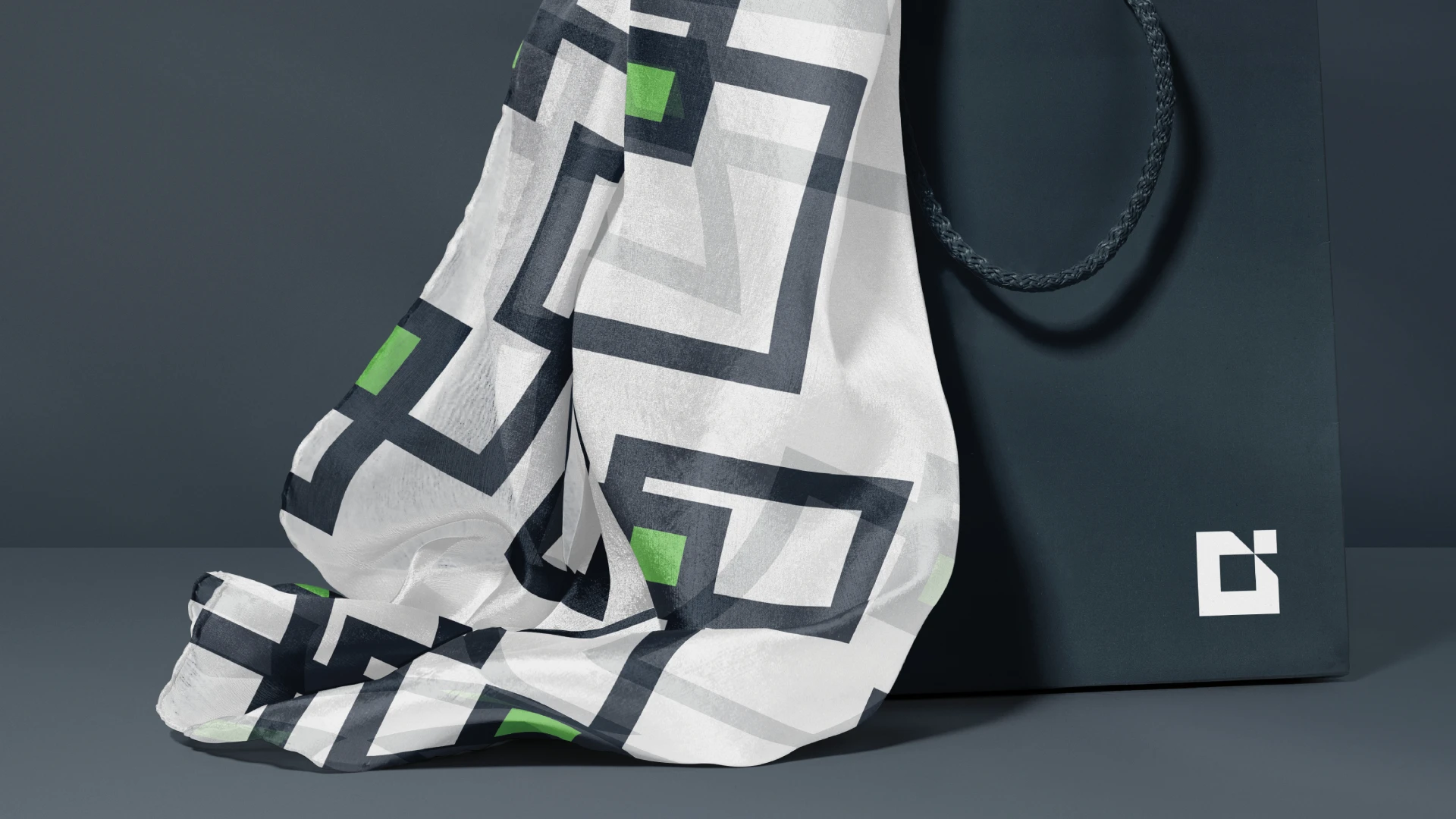
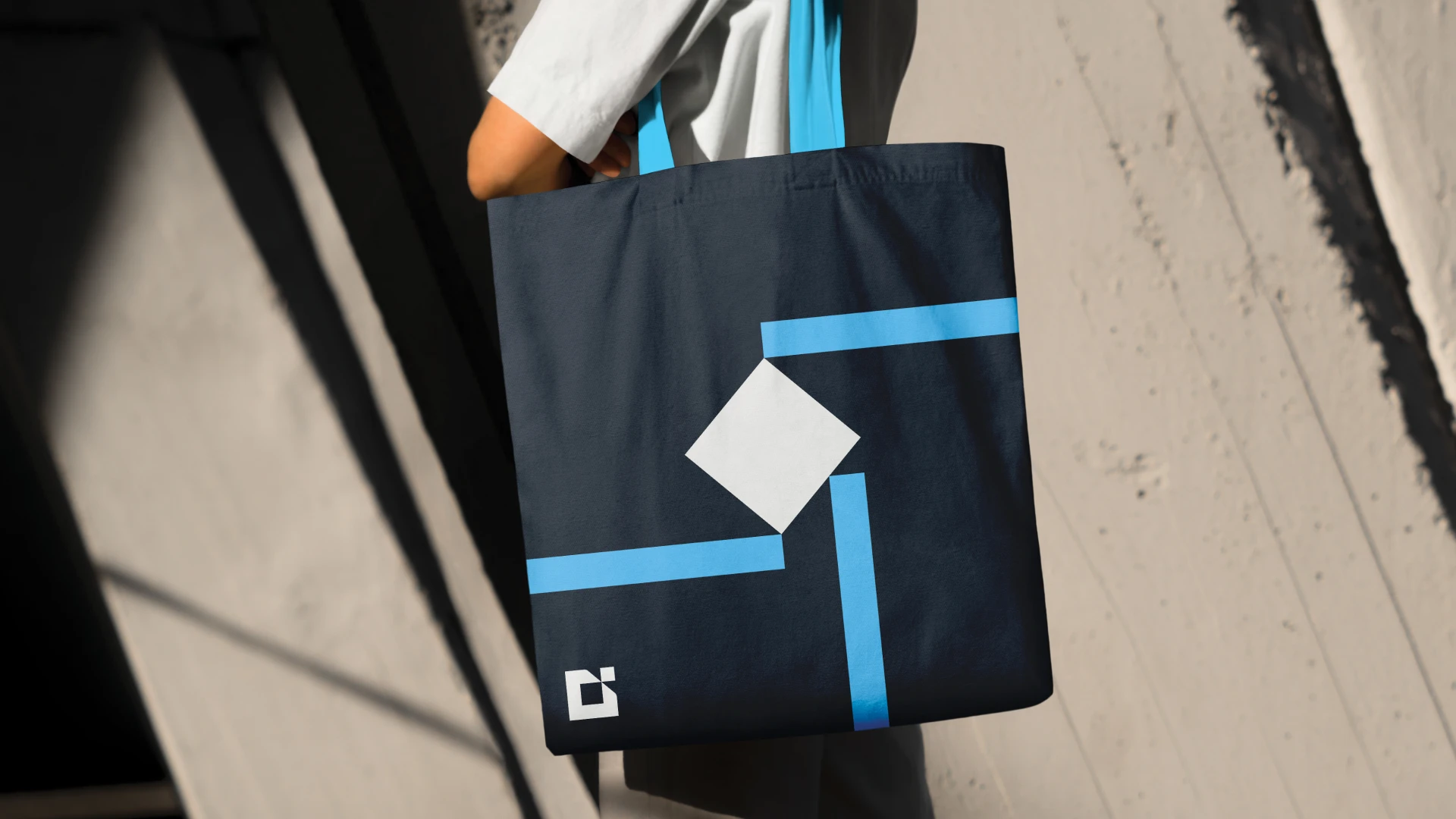
“A view apart” became the focus of the new brand. We created a series of shapes and illustrations based off of the 45- and 90-degree angles of the logo and new color combinations to visualize the complexity of their business. With bespoke illustrations, framing devices, graphics and a new color palette, the breadth of tools in the updated brand toolkit brought new life, energy and consistency to every brand communication, readying Milliman at their 75th anniversary for the next 75 years.