You may have noticed things look a little different at weareagenda.com. And it’s not just a new website—we’re launching a new brand for our agency.
You’ve probably heard the saying, “The cobbler’s kids have no shoes.” Well, that was us. Cobbler’s kids, no shoes, running around with a brand that worked but didn’t really do justice to our strengths, our story and us on our best day.
So, we decided to put our own processes to the test, with a couple of key “clients” from our leadership team, to create a brand that celebrates what we’ve built over the last 25 years and sets us up for the next 25.
Read on for behind the scenes on our strategy, creative process and the meaning behind the final product.
Finetuning our strategy
Just like with our clients, our goal was to hone in on what makes Agenda great. It started with taking a hard look at our positioning as an agency. And what we found? Actually, it was working. If you know us at all, you know we believe in finding your awesome and making it obvious. And that’s not going to change. It’s core to who we are and guides our process.
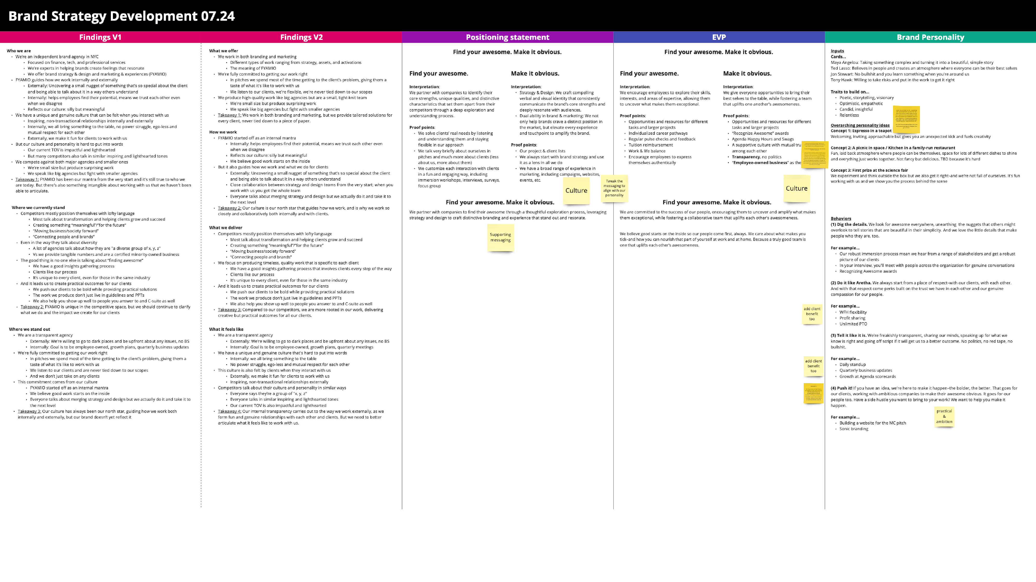
But we did think we could be clearer about what that means to audiences, from clients to employees. We defined new messaging that breaks apart what FYAMIO (Find your awesome. Make it obvious.), as we now call it, means to our work and our people.
Next, we defined the Agenda personality. It’s “Espresso in a teapot.” Because with Agenda, what you see isn’t necessarily what you get. We look small, but we’re mighty. We’re approachable but we give you an unexpected kick that jumpstarts creativity and fuels possibility.
Finally, we defined values with some great names. Things like “Do it like Aretha” which explains the respect we have for each other and how we’re hard on the work but not the people.
Exploring new visual angles
With our strategy in place, it was time to think about our visual identity. Here, nothing was sacred. Everything was on the table to change. Especially our colors. Vincent really hated those. The goal was for it to feel bold, timeless, witty, eclectic and unconventional.
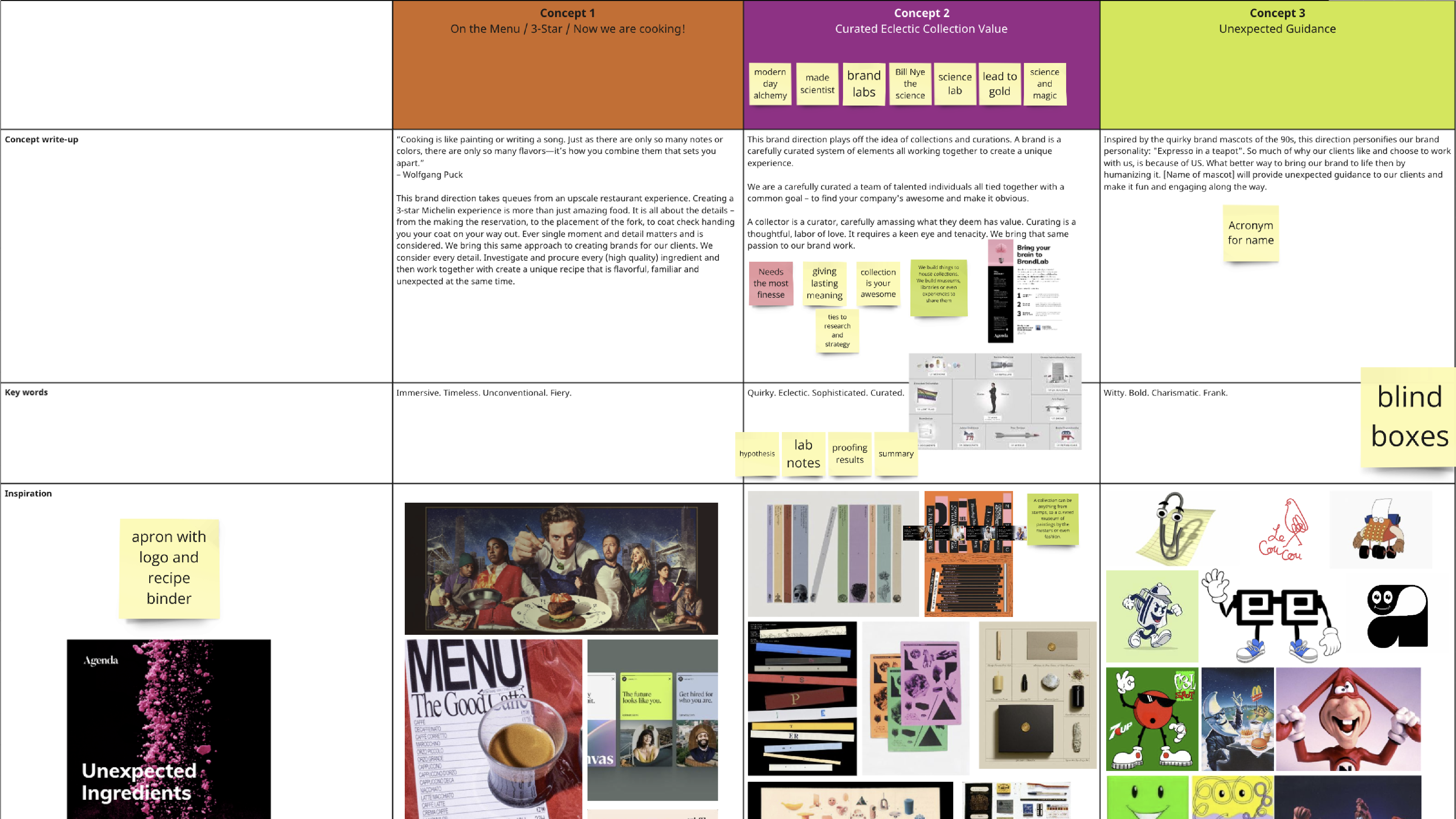
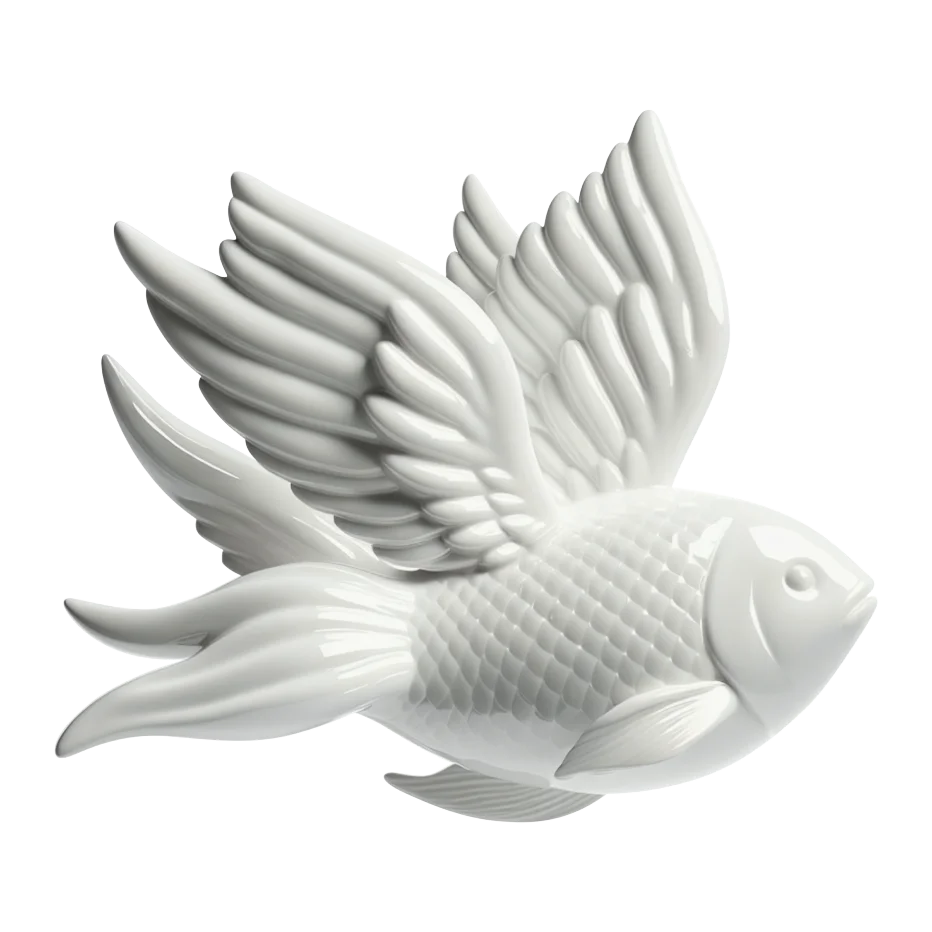
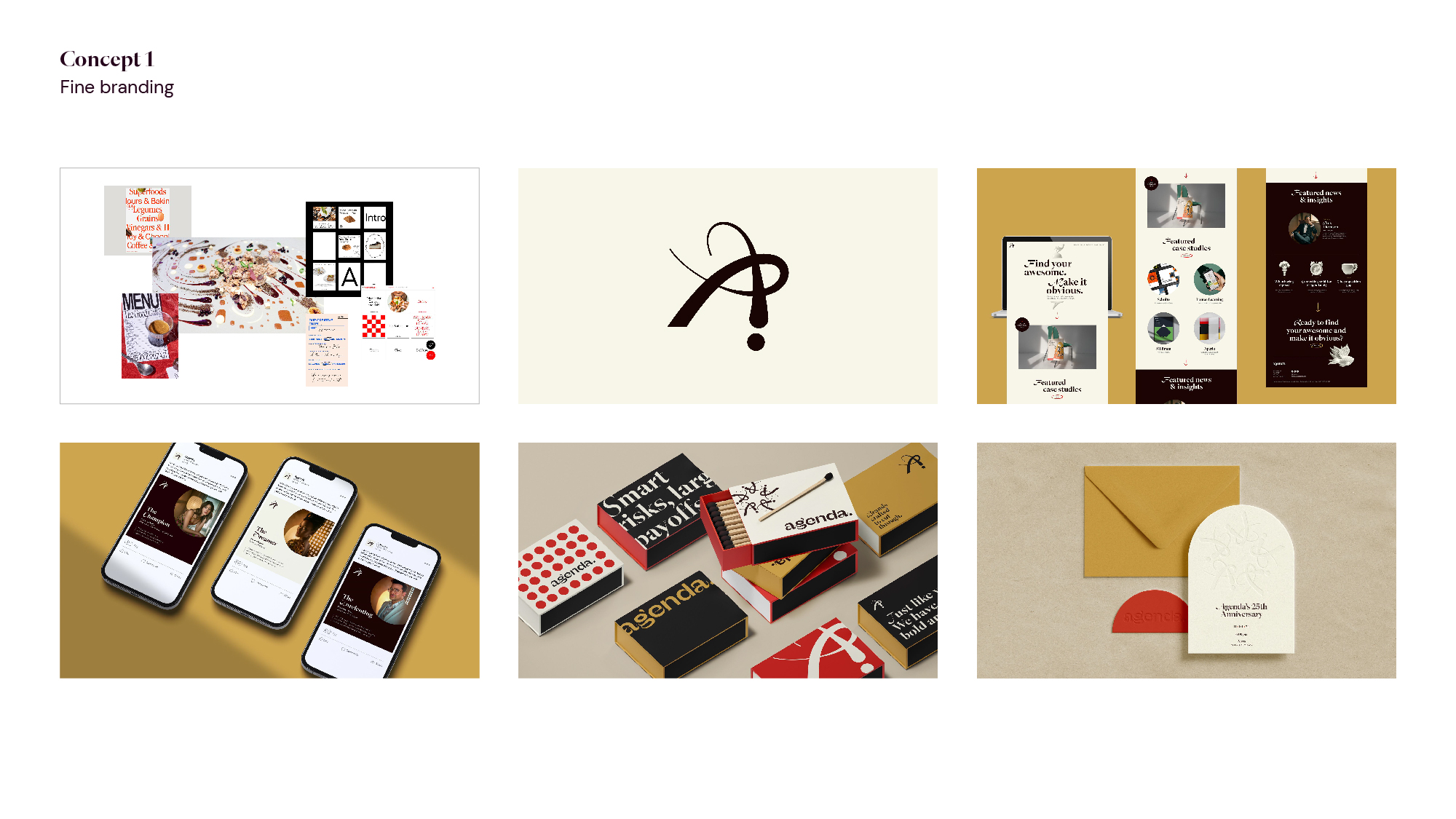
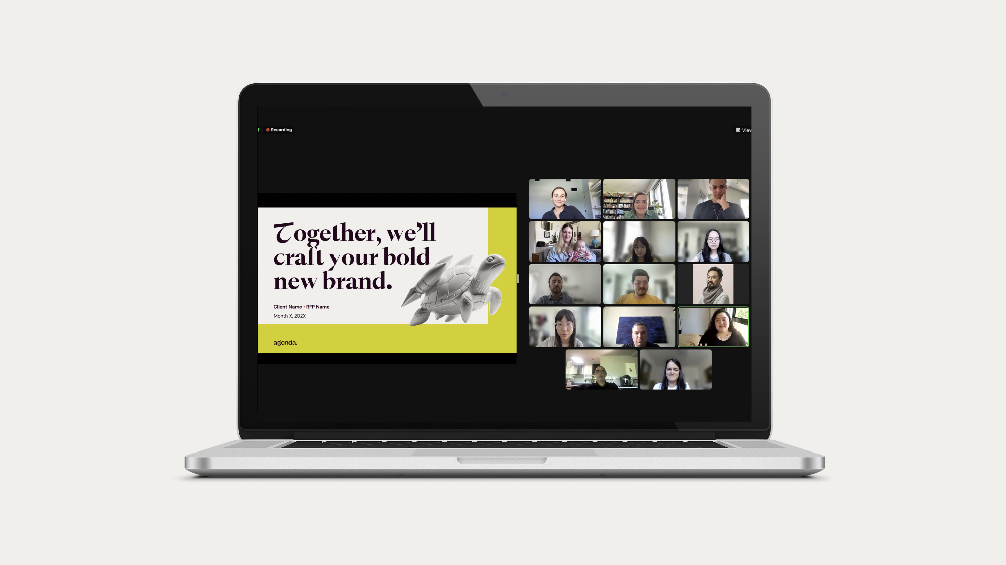
Our first direction took inspiration from fine dining and the way that just as every element of the meal is considered, at Agenda, we take into account every detail to build extraordinary brands. This direction featured an artistic wordmark and AI-generated porcelain objects that bring two unexpected things together (including our favorite: a turtle/rocket ship). It shone a light on the output of our efforts and why clients work with us.
The second direction was alchemy-meets-curio shop, drawing on the way we blend science and creativity. With a wordmark that looks like a Mylar balloon and takes inspiration from the alchemical properties of silver and a photography style that celebrates curating weird and awesome things, it felt like the best parts of our process.
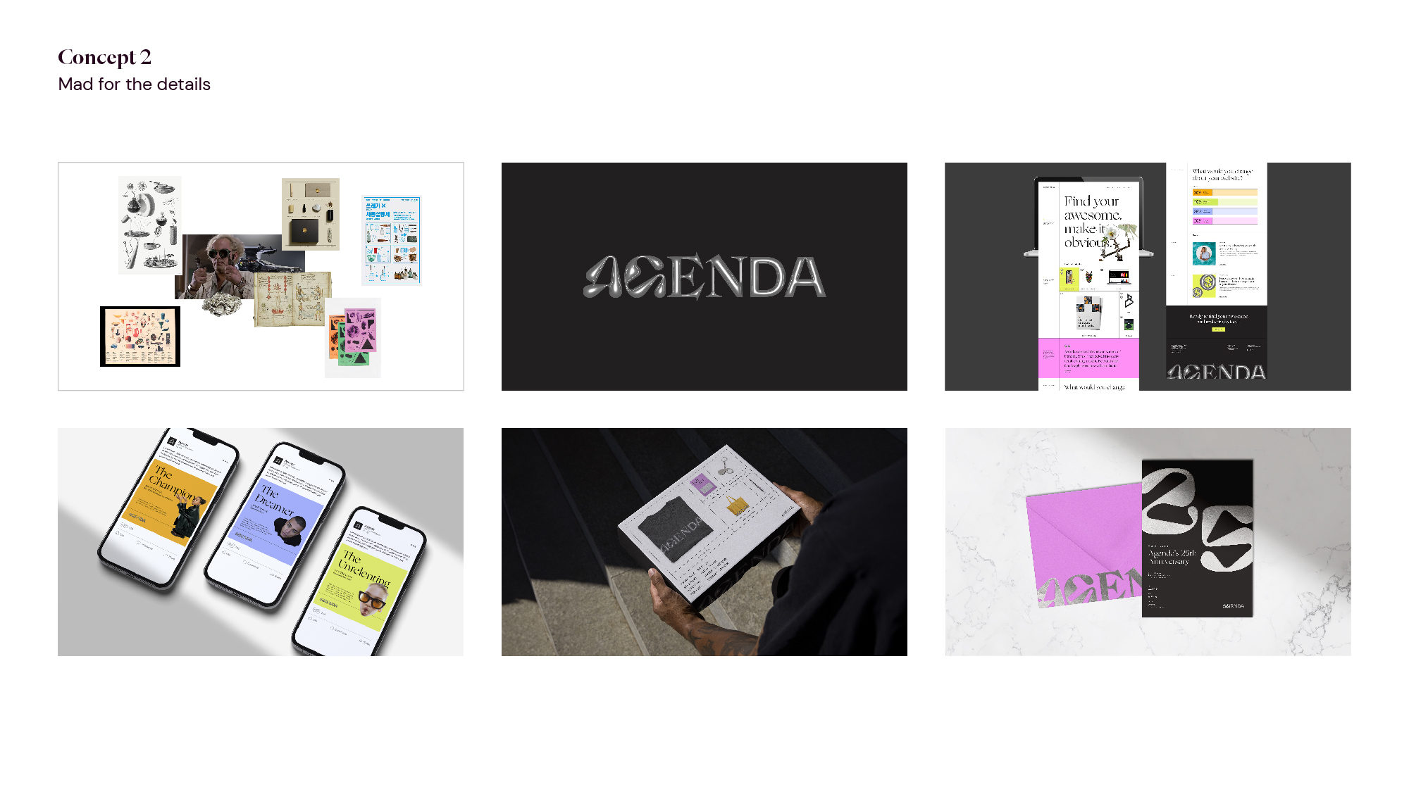
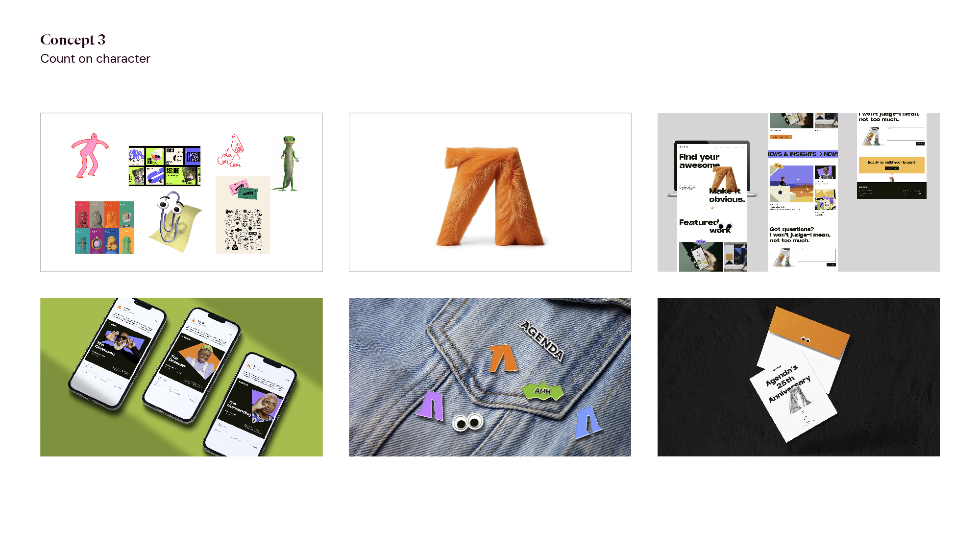
Finally, we had Archie, a beloved mascot shaped like the letter A. Archie could be fuzzy or prickly, made of grass, yarn or steel. He was a little bit sarcastic but also helpful. Your guide to all things brand. And we loved him. But if you love something, you have to let it go, especially if it feels maybe a little too playful for the caliber of clients you work with.
The winning direction
Ultimately, fine dining won. We loved the sophistication of this direction, with the subtle playfulness of the porcelain objects.
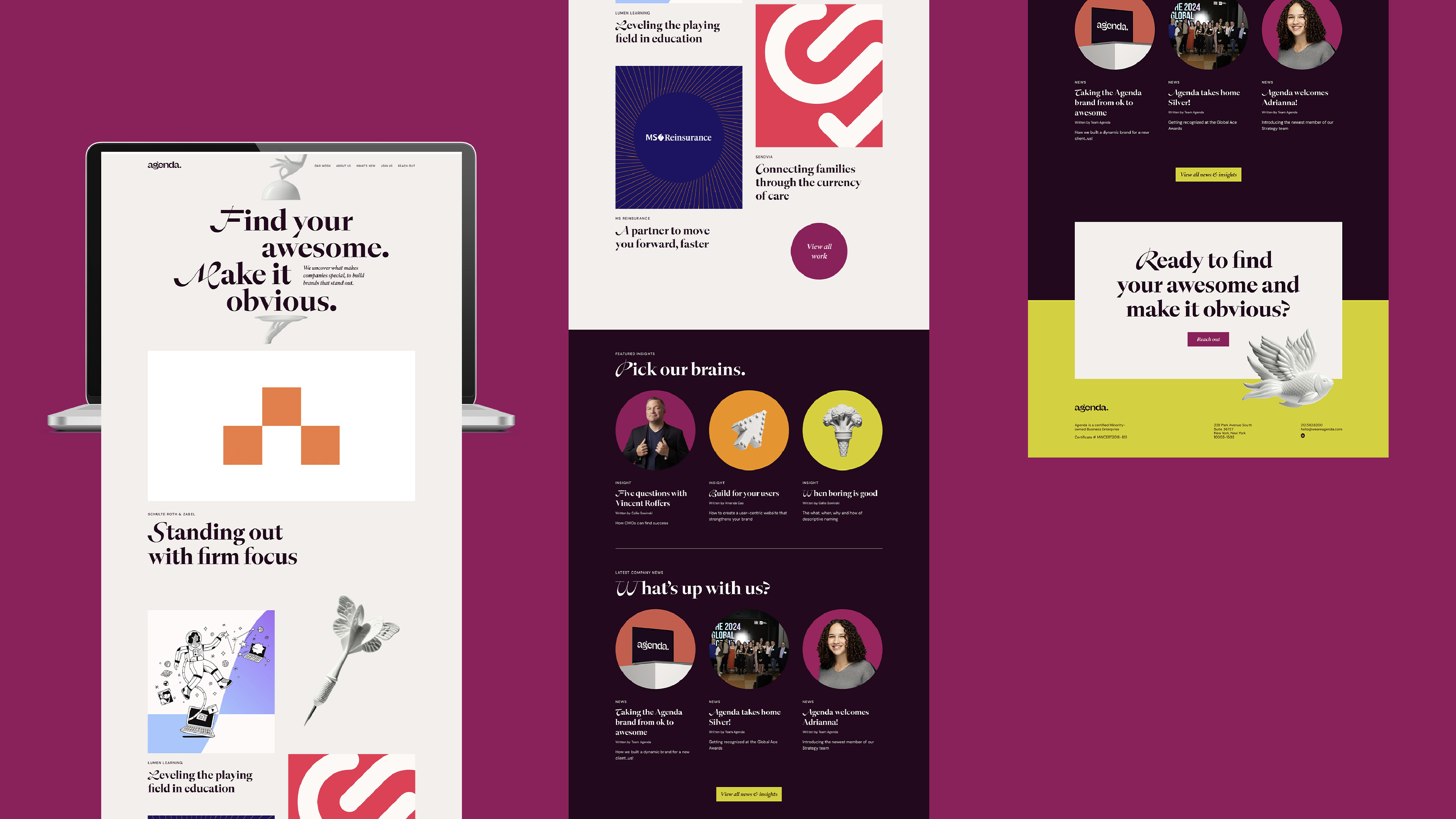
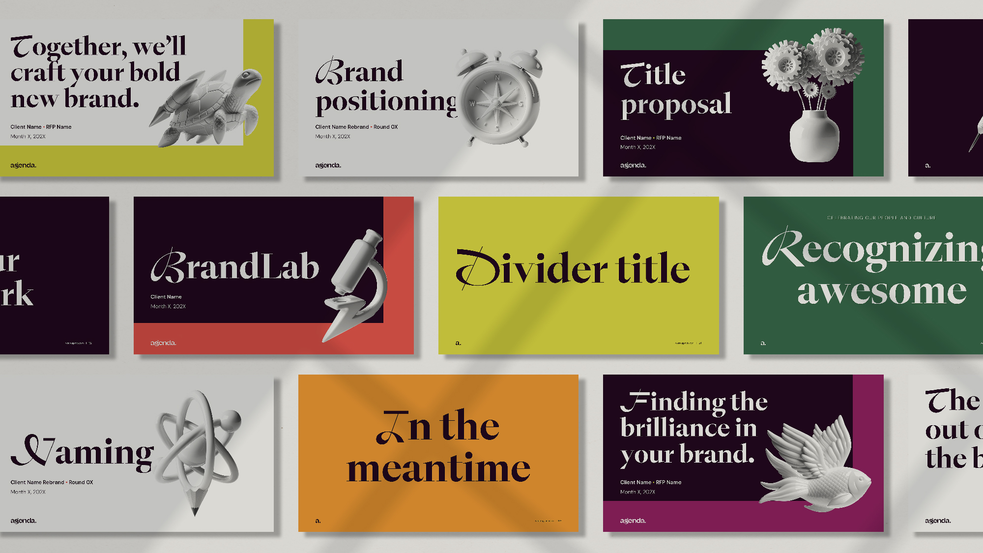
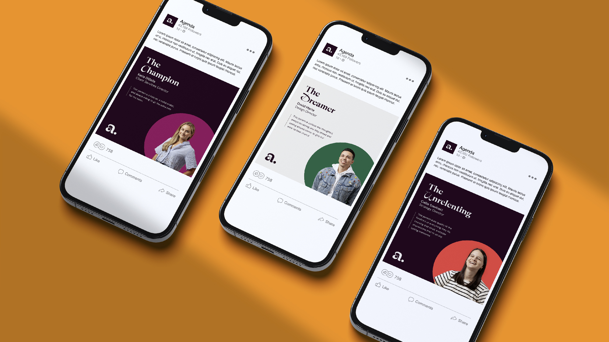
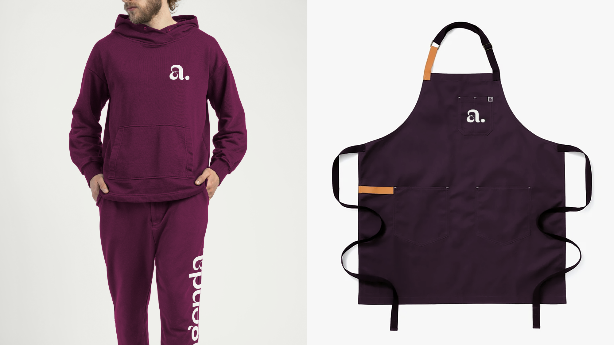
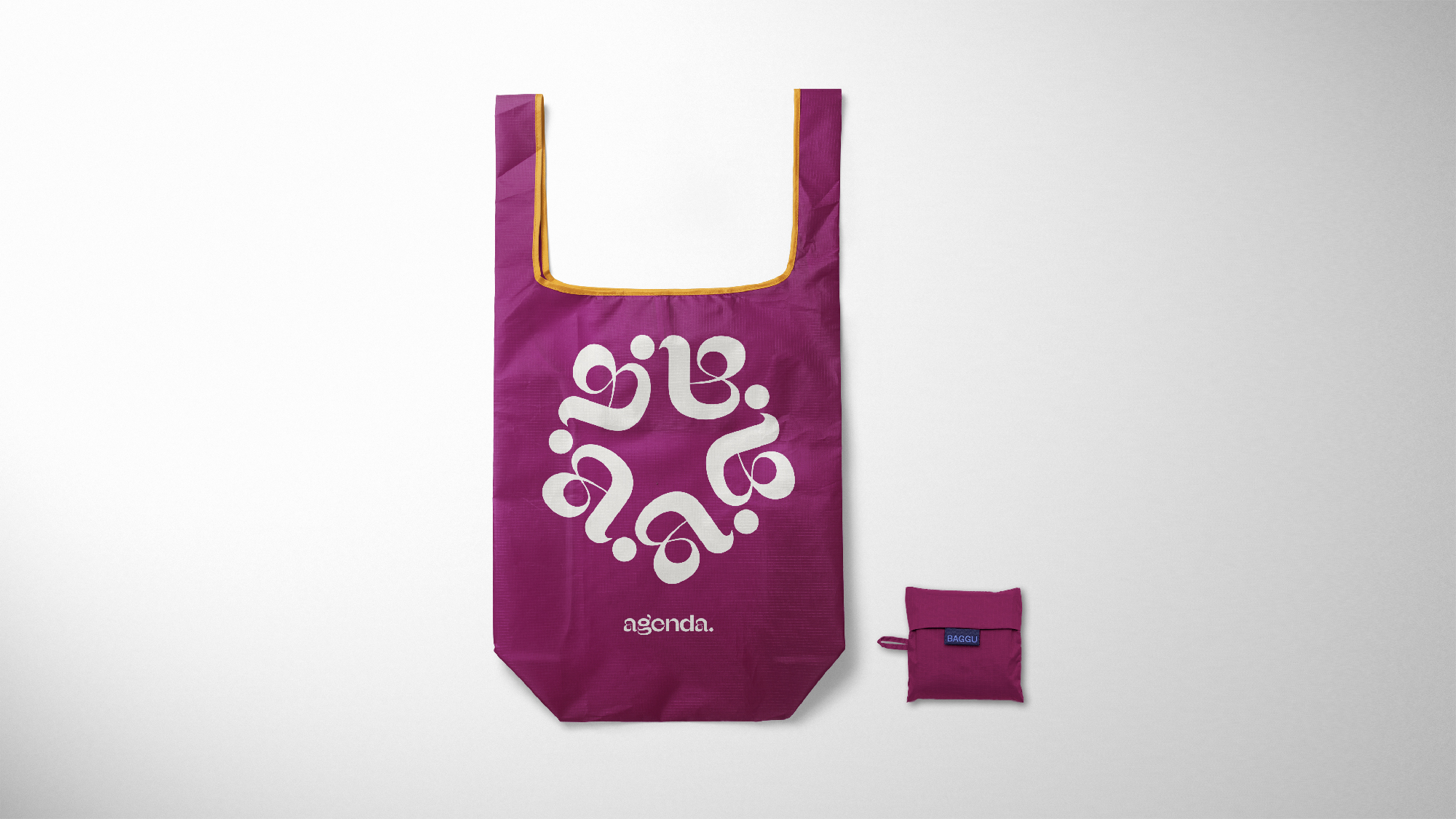
It lets our clients’ brands shine while also giving our brand a presence. We worked on refining the wordmark, color palette and porcelain objects. Then, it was time to think about how it comes to life across every touchpoint, from immersion session boards to client presentations to swag to team photography. (You may have noticed a sneak peek of our headshots on LinkedIn.)
And finally, it’s here online. We’re so proud of this work and the way our process took us to awesome places. And we learned a lot along the way. Like, it’s ok if something’s working. Let it be. Or 3-month-olds make really tough clients (looking at you, August Korn).
But mostly that we love working at this place and now, we have a brand that feels like Agenda, out loud.